Plotting
Last updated on 2025-10-21 | Edit this page
Estimated time: 30 minutes
Overview
Questions
- How can I plot my data?
- How can I save my plot for publishing?
Objectives
- Create a time series plot showing a single data set.
- Create a scatter plot showing relationship between two data sets.
matplotlib is the
most widely used scientific plotting library in Python.
- Commonly use a sub-library called
matplotlib.pyplot. - The Jupyter Notebook will render plots inline by default.
- Simple plots are then (fairly) simple to create.
PYTHON
time = [0, 1, 2, 3]
position = [0, 100, 200, 300]

plt.plot(time, position)
plt.xlabel('Time (hr)')
plt.ylabel('Position (km)')
Display All Open Figures
In our Jupyter Notebook example, running the cell should generate the figure directly below the code. The figure is also included in the Notebook document for future viewing. However, other Python environments like an interactive Python session started from a terminal or a Python script executed via the command line require an additional command to display the figure.
Instruct matplotlib to show a figure:
This command can also be used within a Notebook - for instance, to display multiple figures if several are created by a single cell.
Plot data directly from a Pandas dataframe.
- You can also plot data directly from a DataFrame.
- Let’s start with the
gdp_americasCSV file.
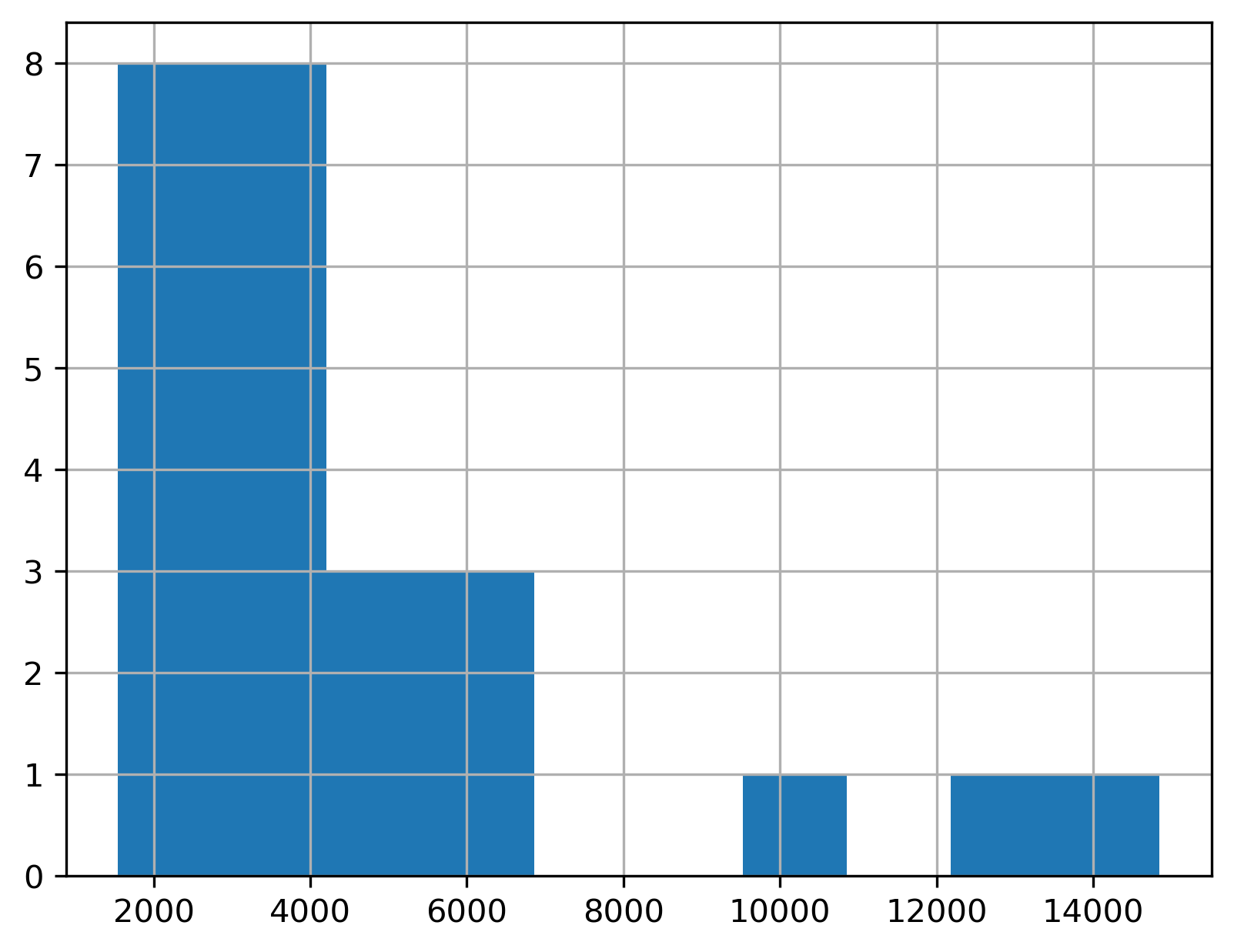
- To plot a single, numeric variable you can use a histogram.
- We can plot the distribution of GDP in 1957 by using
.locto select the column followed by.hist().
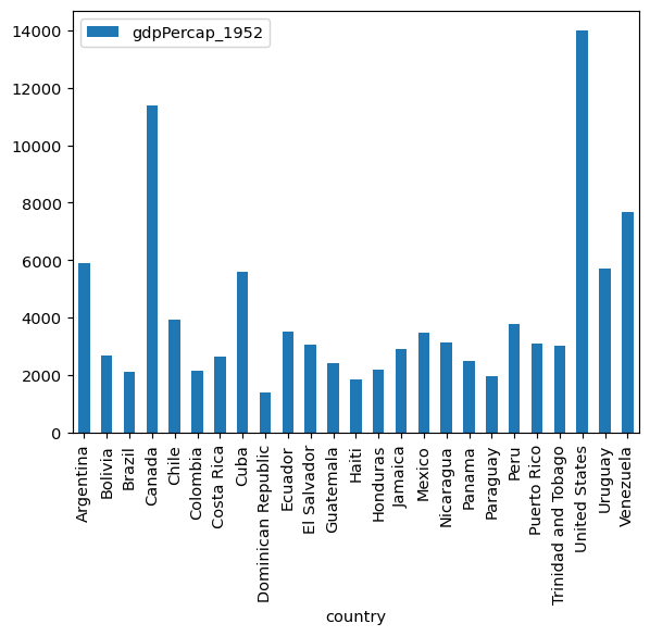
To plot two or more variables, you can use the built-in Pandas bar chart feature.
For example, to plot the GDP of each country in
gdp_americasin 1952 as a bar chart, assign “country” to the x-axis and “gdpPerCap_195” to the y-axis.
Pandas is great for making quick charts, but matplotlib will give you more control and customization options.
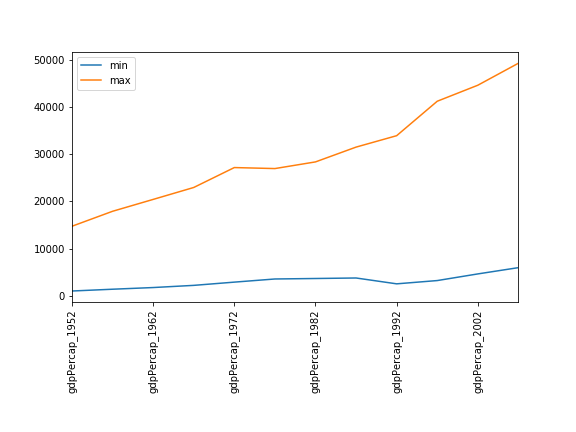
Minima and Maxima
Fill in the blanks below to plot the minimum GDP per capita over time for all the countries in Europe. Modify it again to plot the maximum GDP per capita over time for Europe.
Correlations
Modify the example in the notes to create a scatter plot showing the relationship between the minimum and maximum GDP per capita among the countries in Asia for each year in the data set. What relationship do you see (if any)?
PYTHON
data_asia = pd.read_csv('data/gapminder_gdp_asia.csv', index_col='country')
data_asia.describe().T.plot(kind='scatter', x='min', y='max')
No particular correlations can be seen between the minimum and maximum GDP values year on year. It seems the fortunes of asian countries do not rise and fall together.
Correlations (continued)
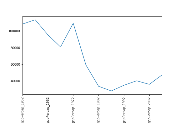
Seems the variability in this value is due to a sharp drop after 1972. Some geopolitics at play perhaps? Given the dominance of oil producing countries, maybe the Brent crude index would make an interesting comparison? Whilst Myanmar consistently has the lowest GDP, the highest GDP nation has varied more notably.
More Correlations
This short program creates a plot showing the correlation between GDP and life expectancy for 2007, normalizing marker size by population:
PYTHON
data_all = pd.read_csv('data/gapminder_all.csv', index_col='country')
data_all.plot(kind='scatter', x='gdpPercap_2007', y='lifeExp_2007',
              s=data_all['pop_2007']/1e6)
Using online help and other resources, explain what each argument to
plot does.

A good place to look is the documentation for the plot function - help(data_all.plot).
kind - As seen already this determines the kind of plot to be drawn.
x and y - A column name or index that determines what data will be placed on the x and y axes of the plot
s - Details for this can be found in the documentation of plt.scatter. A single number or one value for each data point. Determines the size of the plotted points.
Saving your plot to a file
If you are satisfied with the plot you see you may want to save it to a file, perhaps to include it in a publication. There is a function in the matplotlib.pyplot module that accomplishes this: savefig. Calling this function, e.g. with
will save the current figure to the file my_figure.png.
The file format will automatically be deduced from the file name
extension (other formats are pdf, ps, eps and svg).
Note that functions in plt refer to a global figure
variable and after a figure has been displayed to the screen (e.g. with
plt.show) matplotlib will make this variable refer to a new
empty figure. Therefore, make sure you call plt.savefig
before the plot is displayed to the screen, otherwise you may find a
file with an empty plot.
When using dataframes, data is often generated and plotted to screen
in one line. In addition to using plt.savefig, we can save
a reference to the current figure in a local variable (with
plt.gcf) and call the savefig class method
from that variable to save the figure to file.
Making your plots accessible
Whenever you are generating plots to go into a paper or a presentation, there are a few things you can do to make sure that everyone can understand your plots.
- Always make sure your text is large enough to read. Use the
fontsizeparameter inxlabel,ylabel,title, andlegend, andtick_paramswithlabelsizeto increase the text size of the numbers on your axes. - Similarly, you should make your graph elements easy to see. Use
sto increase the size of your scatterplot markers andlinewidthto increase the sizes of your plot lines. - Using color (and nothing else) to distinguish between different plot
elements will make your plots unreadable to anyone who is colorblind, or
who happens to have a black-and-white office printer. For lines, the
linestyleparameter lets you use different types of lines. For scatterplots,markerlets you change the shape of your points. If you’re unsure about your colors, you can use Coblis or Color Oracle to simulate what your plots would look like to those with colorblindness.
-
matplotlibis the most widely used scientific plotting library in Python. - Plot data directly from a Pandas dataframe.
- Select and transform data, then plot it.
- Many styles of plot are available: see the Python Graph Gallery for more options.
- Can plot many sets of data together.